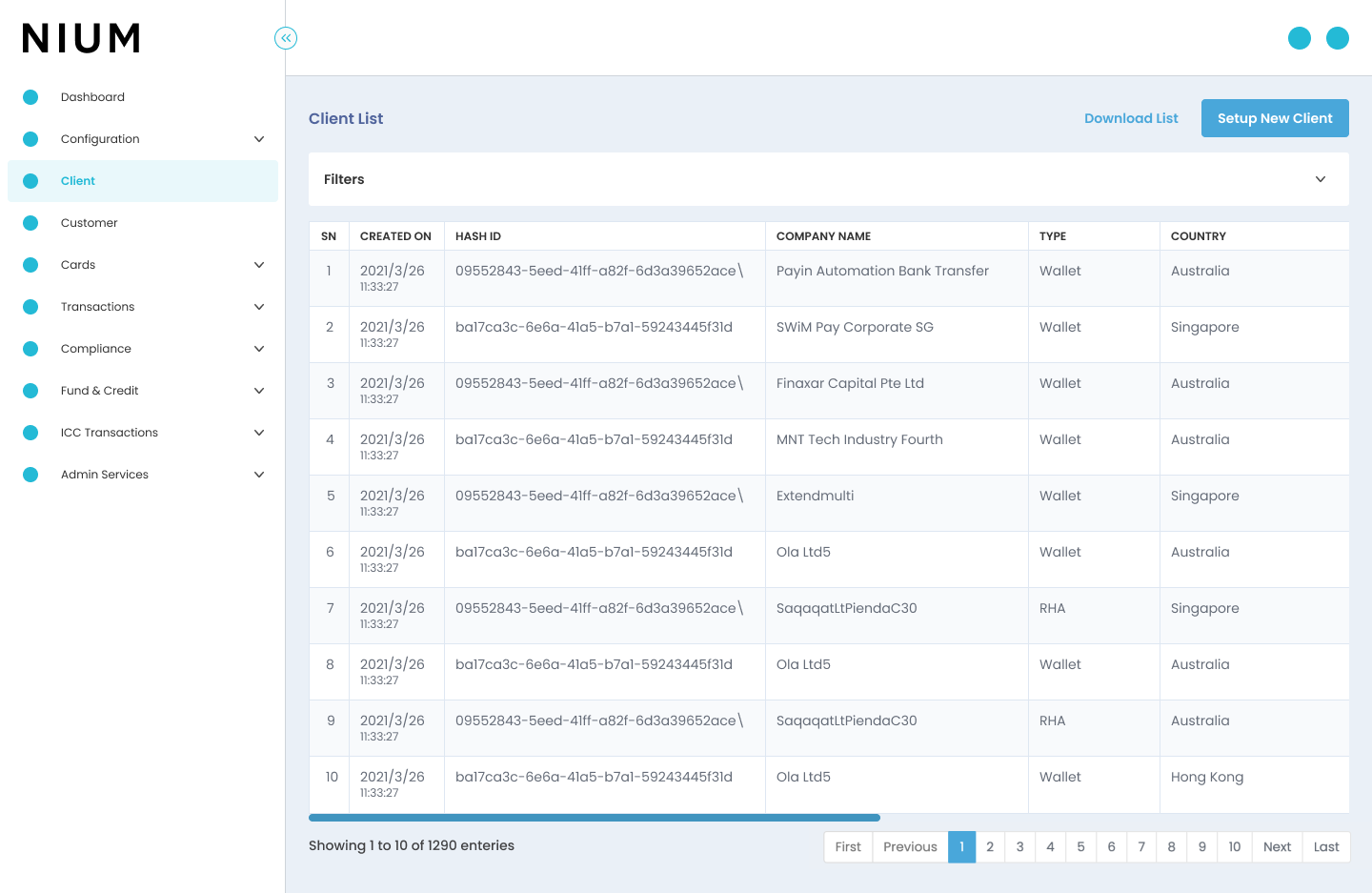
Our goal was to redesign the corporate client onboarding process. The current onboarding experience has been identified as a pain point for the internal team, resulting in late onboarding of clients and inefficiencies. The aim of this project is to create a seamless, user-friendly, and efficient client onboarding/creation flow that ensures a positive experience for the internal team.
The target audience includes internal team whose aim is to create the accounts for clients.
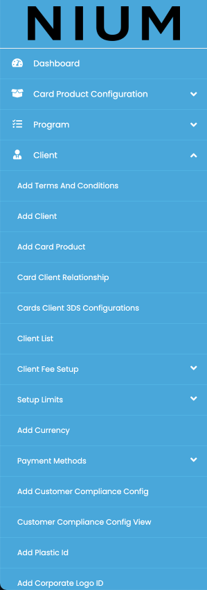
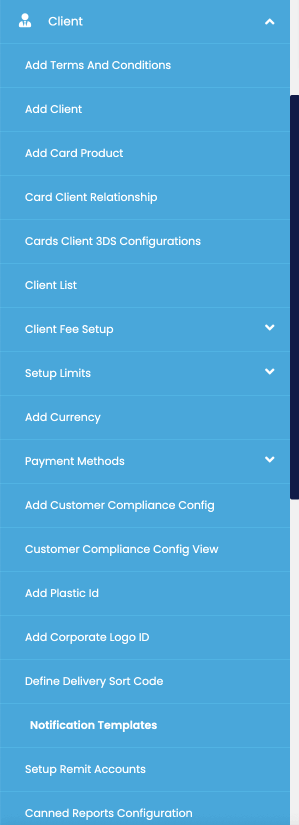
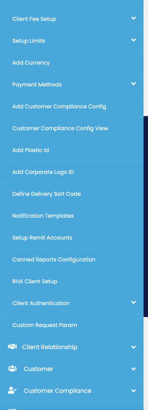
In this phase, I brainstormed and sketched various solutions to address the identified pain points. I also collaborated with the development team to assess the feasibility of each solution.
With the proposed solutions, I created wireframes and interactive prototypes to visualize the new client creation process. I focused on a clean and intuitive design with a user-friendly interface.
I conducted usability testing with a group of potential users. I observed their interactions with the prototypes and gathered feedback to identify any usability issues and areas for improvement.
Based on the testing feedback, I iterated on the designs and collaborated with the development team to implement the finalized onboarding process.
Landing Page : The landing page welcomes users with a clean and inviting design, clearly stating the current client list. A prominent call-to-action (CTA) leads users to start the client creation process.

Simplified Onboarding Form : The onboarding form has been optimized for simplicity, collecting essential information. Each step is presented one at a time, reducing cognitive load and encouraging completion.
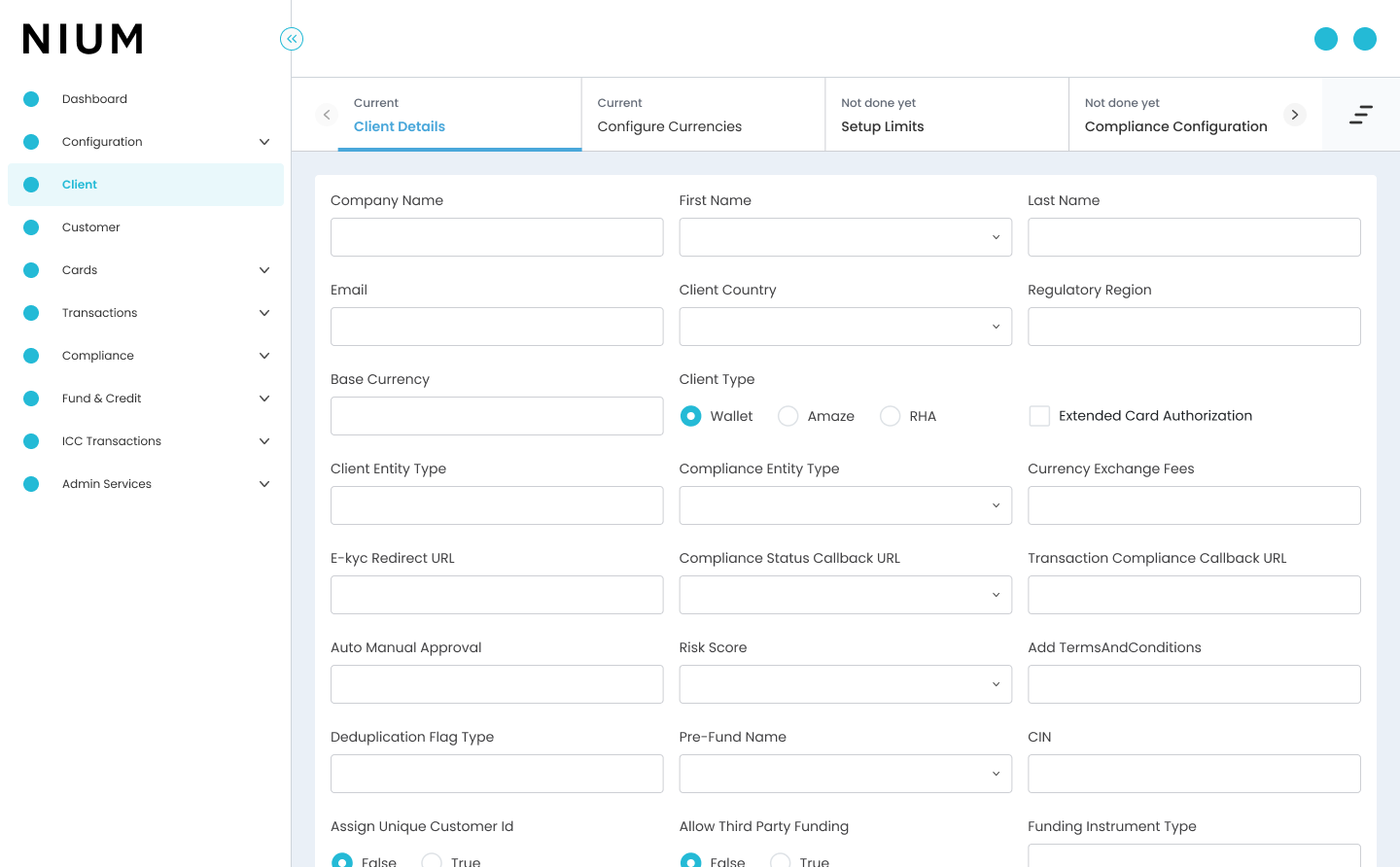
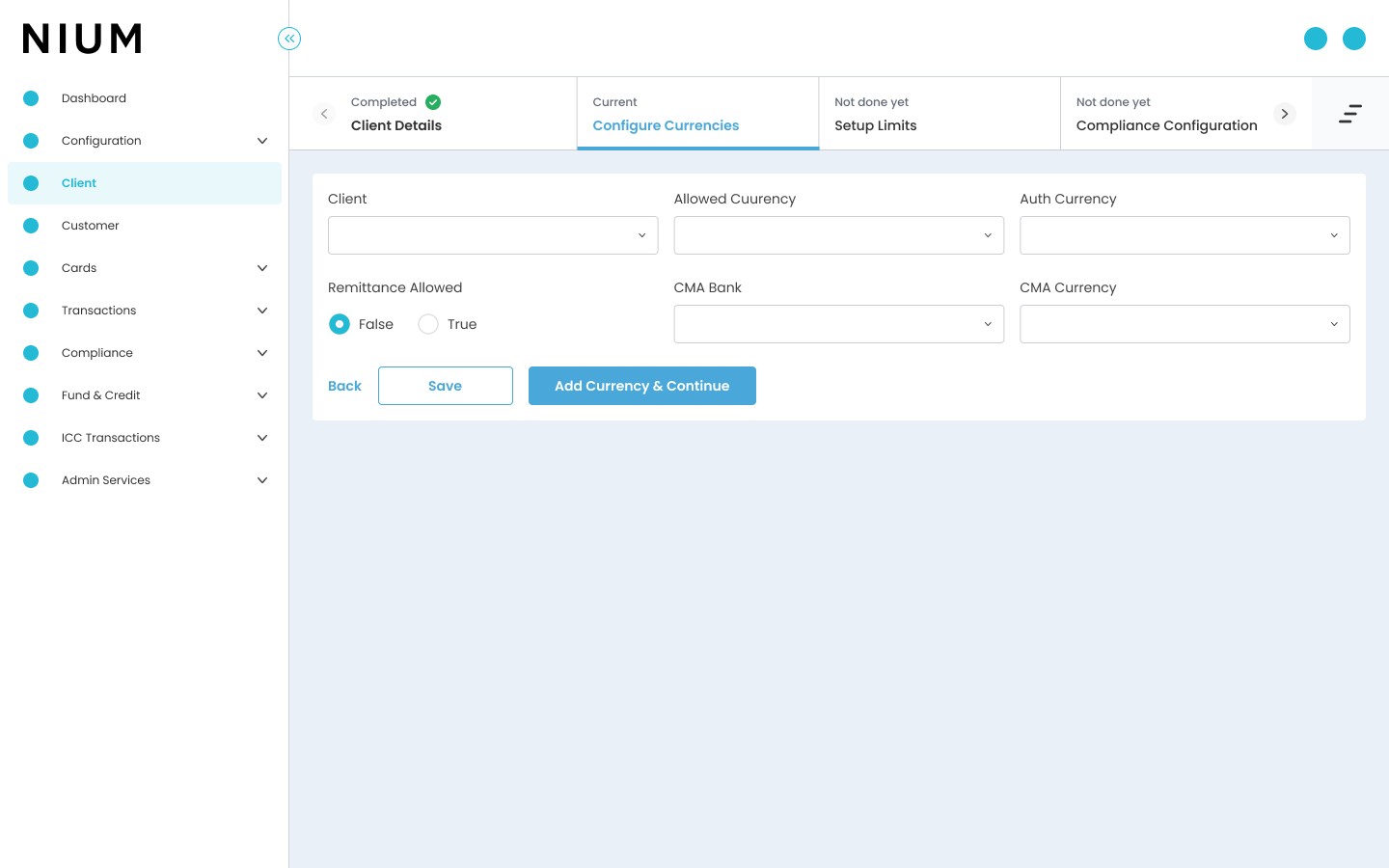

Transparent Progress Tracker : A progress tracker shows users their current position in the onboarding process and highlights the remaining steps, providing transparency and motivation.
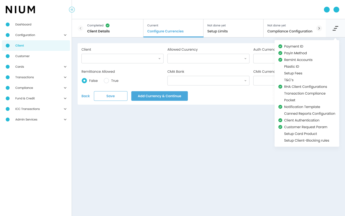
The redesign of client creation process aims to significantly improve the user experience, and reduce time to complete the process. By simplifying the journey and incorporating progressive profiling, smart form validation, we reduced user friction and increased user confidence. The visual progress indicators keep users engaged and informed throughout the process. As a result, the user experienced a significant decrease in time to complete the process, ultimately leading to improved customer satisfaction and business growth.
Back To Projects