Project Overview
RIVIGO Express is a one-stop solution for all your shipping related needs. With over 29,000+ pin codes serviced through 4,000+ self-owned trucks.
RIVIGO is a new age technology enabled company ensuring fastest delivery times (30% lower than competition) and record lowest damages (5x lower than competition).
Role
User Experience, Interaction, Prototyping & User Interface Design
Timeline
October 2019 - November 2019
Project Objectives
- Simplify the cargo booking process, reducing the steps required.
- Improve user engagement and satisfaction.
- Enhance the visibility of shipment details and tracking.
- Increase the efficiency of communication between users and customer support.
- Drive adoption by creating ease of discovery for newly launched features.
- Decrease manual work of the agents on booking.
Research Phase
The design team and product team conducted user research involving current customers and potential users. Interviews, and usability testing were carried out to understand pain points and user preferences.
Findings
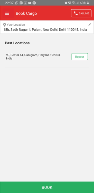
- Complex Booking Process : Users expressed frustration with the existing booking
process, which involved redundant data entry and confusing terminology.
- Lack of Transparency : Users were unsure about the status of their shipments and found it difficult to track their cargo's progress.
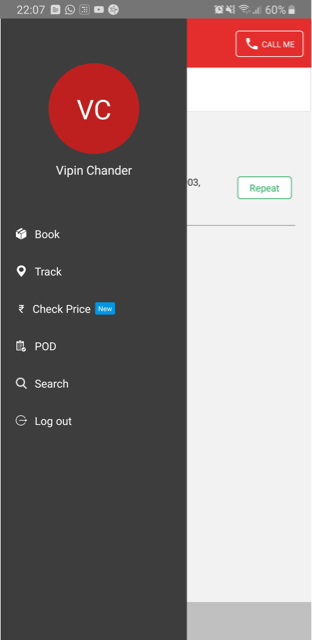
- Difficult to get the Proof of Delivery (POD) : To obtain proof of delivery, the user had to manually enter the CN number, which was difficult to remembe
- Limited Support : Users felt that customer support was not readily accessible in case of issues or queries during the booking process.
Solution Proposed
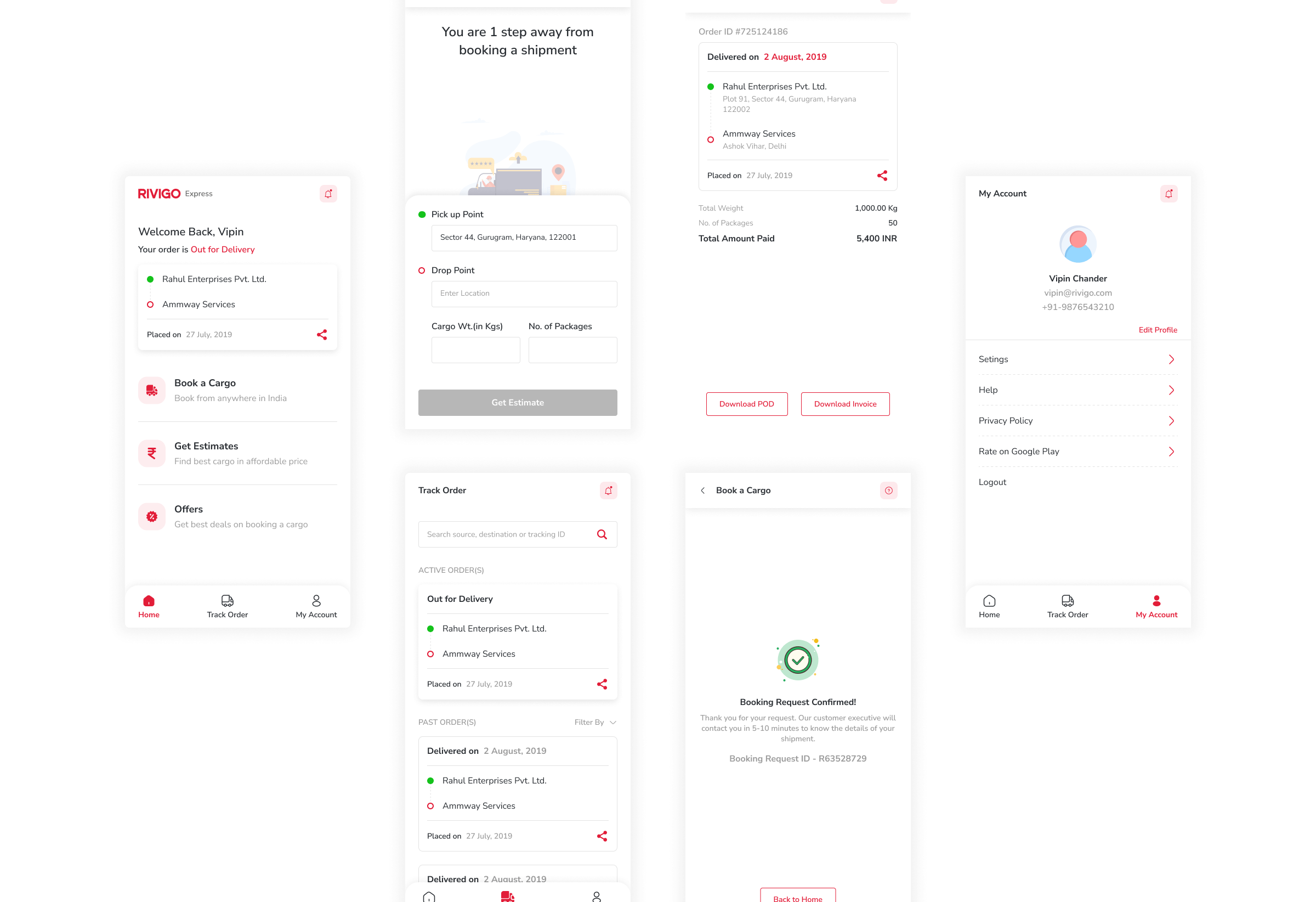
1. Streamlined Booking Process
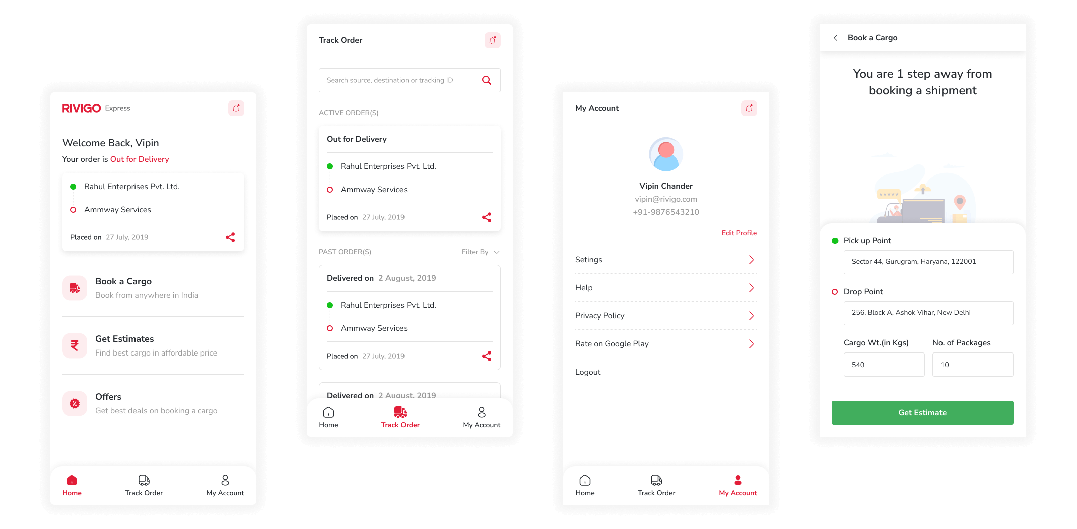
- Single-Step Booking : Condensed the booking process into a single, intuitive form, eliminating unnecessary steps and inputs.
- Auto-Fill and Suggestions : Utilized previous booking history and location services to pre-fill common details like pickup/delivery locations and cargo dimensions.
2. Enhanced Visibility
- Real-Time Tracking : Integrated a tracking feature that allows users to see the real-time location of their cargo.
- Notifications : Sent proactive notifications to users at key stages of their shipment's journey, such as when it's picked up, in transit, and delivered.
Prototype and Testing
Based on the design solutions, a high-fidelity prototype was developed. Usability testing was conducted with a group of representative users to identify any usability issues or pain points. Iterative improvements were made based on the feedback received.
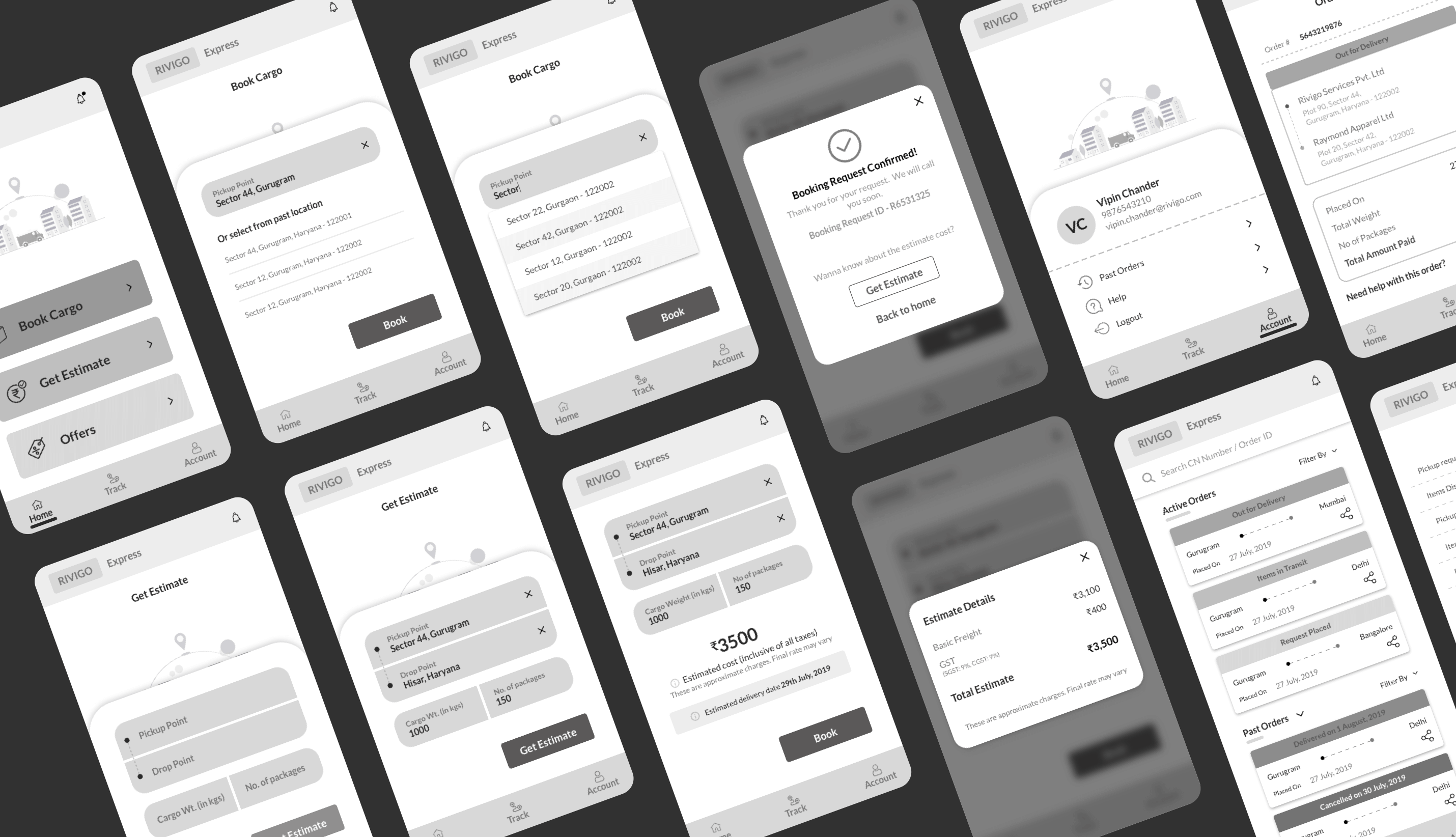
Wireframes

Results
- Simplified Booking : Users reported a significant reduction in the time and effort required to book cargo shipments.
- Increased Transparency : Users praised the tracking feature, mentioning how it helped them stay informed and confident about their cargo's whereabouts.
Final Layout

Conclusion
By focusing on user needs and pain points, the redesigned cargo booking process in the mobile app achieved its goals of simplifying the booking process, enhancing visibility, and improving customer support. The streamlined process led to increased user satisfaction, improved engagement, and a more efficient overall experience for both existing and new users.
Back To Projects
